I am trying to:
hey there, i want to add some css styling. to test the styling i always use the regular html fields to get the look.
but the same code that works for the html field does not work on the toolset form!
HTML Form and Styling (i used custom-form-group to show the differences of both fields)
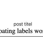
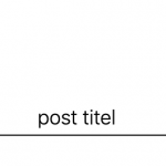
with this code i get a floating label (screenshot:1 & 2)
<div class="form-group custom-form-group">
	<input name="test" type="text" required="">
    <label>post titel</label>
</div>

//css code
.custom-form-group {
    position: relative;
    padding: 20px 0;
    width: 100%;
    max-width: 100%;
}
.custom-form-group input {
    border: none;
    border-bottom: 1px solid black;
    border-radius: 0;
    display: block;
    font-size: 20px;
    padding: 1px 0;
    width: 100%;
    font-family: frank-ruhl;
    text-align: center;
}
.custom-form-group label {
    width: 100%;
    color: black;
    font-size: 16px;
    font-weight: 100;
    position: absolute;
    top: 0;
    left:0;
    pointer-events: none;
    transform: translateY(30px);
    text-align: center;

}

.form-group .custom-form-group input:valid,
.form-group .custom-form-group input:focus {
    border-bottom-color: black;
    outline: none;


}

.custom-form-group input:valid + label,
.form-group .custom-form-group input:focus + label {
    color: black;
    font-size: 14px;
    transform: translateY(0);
    top:8px;
}

.custom-form-group label {
    transition: all .2s ease-in-out;
}
i tried the same css code with the .wpt-form-textfield class mentioned here:
https://toolset.com/documentation/user-guides/styling-cred-forms/#input
no styles are working (screenshot 3)
any ideas why the toolset forms will not load the styling?
sorry waqr don´t get it what to do when you say: "I've checked and there is no , at the end of input.wpt-form-textfield at two places. Please fix this
input.wpt-form-textfield"
my class is input.wpt-form-textfield
Hi Steffen,
Sorry, it seems that our chat was disconnected.
I'm performing a detailed review of that CSS code and will share my findings through this ticket.
regards,
Waqar
Hi Steffen,
I've checked the customizer CSS code and looks like you've managed to add changes to those styles and they're now working.
Earlier, the style for the "wpt-form-textfield" class was added in multiple lines and was missing a "," character at the end, as can be seen in this screenshot, taken during our chat:
enlace oculto
( but this has been fixed now )
Here is a screenshot of the page, with the customizer CSS code:
enlace oculto
And here is a screenshot of the page, without the customizer CSS code:
enlace oculto
Note: To check which CSS code is applying to different page elements and which of them is being overridden by other styles, you can use Google Chrome's inspect element tool, as explained in this guide:
enlace oculto
In case any specific CSS code block is still not working as expected, please specifically include it in reply to this message, with details around what you expected from it and I'll be happy to investigate it, as well.
regards,
Waqar
hey waqar,
most of the css is working now with the input.wpt-form-textfield.
one thing does not: adjacent selectors
here is my code:
// html form with toolset
<div class="form-group pseudo-table">
		[cred_field field='post_title' class='input-style form-control' output='bootstrap']
  		<label class='floating-label'>post titel</label>
</div>
//css
.pseudo-table { display: table;  } // abillity to switch label visually to top
label { display: table-header-group; } // label is on top now
input { display: table-row-group; } // input is on bottom now
input:focus + label { color:red; font-weight: bold; } // label should be red and bold when input is on focus
this works great with html fields but not on toolset. so i have tried different classes like the one you mentioned input.wpt-form-textfield or even when i target the field with its name input[name="post_title"] it does not work.
hope you can help me out of this one!
Hi Steffen,
Thanks for the update and glad that the custom CSS code is working as expected now.
The CSS code block that you refer to is not working, because the input field with class "wpt-form-textfield" and the "label" tag, are not directly adjacent to each other, as shown in this screenshot:
enlace oculto
Please note how the input field is in a div with classes "js-wpt-field-items js-wpt-repetitive wpt-repetitive", whereas the label tag is outside that div.
Since CSS code doesn't support a selector, which can be used to target the label tag in such a situation, you can adopt a workaround that involves some custom script.
In your form's "JS editor" tab, please include this script:
jQuery( document ).ready(function() {

	jQuery( "form.cred-form input" ).focus(function() {
		jQuery(this).parents('div.form-group').addClass('focused-item');
	});

	jQuery( "form.cred-form input" ).focusout(function() {
		jQuery(this).parents('div.form-group').removeClass('focused-item');
	});

});
This will append a "focused-item" class to the field's container div with class "form-group" when the enclosed input tag will be focused and will remove this class when the focus is removed.
As a result, you'll be able to style the focused input field's label, using simpler CSS code:
div.form-group.focused-item label {
font-size:50px;
}
I hope this help and for more personalized assistance and suggestions around custom CSS and JS code, we'll recommend consulting relevant CSS and jQuery forums. You can also consider hiring a professional from our list of recommended contractors:
https://toolset.com/contractors/
regards,
Waqar


