Hello
I am using the content layout editor in a page 'Test Row Layout' - enlace oculto
I have created a row and in that row I have 4 visual editor cells, each 3 blocks in width (col-sm-3).. I have assigned the div a class of 'test-cell' and to this class I have given a background color (.test-cell{background:#999999;})
Within each block I have a simple paragraph <p>Block 1</p> labelling each block.
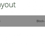
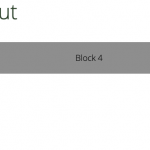
The problem I am having is that in 'Block 1' the first one, the writing is butted up to the left edge but the other three blocks in the row seem to have a left margin.
I'm using this method in a more complex way elsewhere but wanted to simplify the issue so it made more sense....
So when viewing the four blocks on a tablet or phone they are above each other which is correct and each block fills the full width which again is correct, however the inside of the first block (in this case <p>Block 1</p> is aligned differently...
You should be able to access the page ok to see the issue..
I shall look forward to hearing from you.
Regards
Geoff
Hi, can you click the "pencil" icon for this row in your Content Layout editor? Please let me know the settings for row widths. Also, is there a container grid around these 4 cells, or are they placed directly in the row? It might be helpful for me to see a screenshot of your Layout editor screen. Please include one with your next reply and I will review everything.
Hi Christian
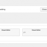
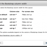
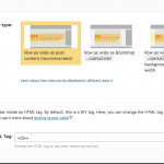
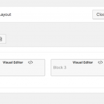
Thank you for your help with this..I have attached 3 screenshots, one of the layout screen editor an another of the settings when clicked on the pencil icon...and one for when the 'column width' button is clicked...
I shall look forward to hearing from you..
Best wishes
Geoff
I'm attaching some screenshots here showing what happens when I remove the full-width class from the row. You can see that left-padding setting begins to work as expected, because I changed the class name to "ddl-full-width-rows" instead of "ddl-full-width-row". So please try the second row type option instead, "Row as wide as Bootstrap container". Try both with and without 15px padding. Since you're using the Bootstrap fluid grid inside an area that is constrained to only 1000px width, I'm not sure offhand which one should work best for your case.
Also, please note: it is not advised to use Toolset Layouts and WPBakery Page Builder on the same site. We suggest you pick one and deactivate the other plugin, otherwise you may run into unresolvable conflicts. We have more information about best practices for using WPBakery with Toolset available in our documentation here: https://toolset.com/documentation/user-guides/using-toolset-with-wpbakery-page-builder/
Hi Christian
That's great thank you..it looks like that has done the trick..I will run some more checks and get back to you if there's any problems..
Best regards
Geoff
Great! I'll stand by for your update.
