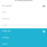
I noticed that when in mobile view and on a page that I've used the Layouts, I'm unable to expand\click on the mobile menu. On all other pages the responsive menus work fine. I'm using Dynamik as a Genesis child theme.
Not sure if it's bootstrap related as also noticed that I was unable to click into the fields... in mobile view. I solved this by wrapping the rows of the form groups in a div with a row class (though I did 'Auto-Generate User Form' so would have assumed it should have added all the necessary html??) Once I added the <div class="row"> I was able to click into my input fields, but my menus remain un-clickable.
URL: hidden link
Dear lindsay,
Is this problem resolved?
I tested the problem page you mentioned above in my phone device, seems it works fine, see the screenshot 3.png, please let me know if you need more assistance for it.
Hi luoy, no I still have a problem. The link I provided now goes to a 404 page which doesn't use a Layout so all is fine (it's been a few days and I reorganised some pages - so sorry).
Try the link below, which does use a Layout and you will see that just in mobile page my button's to expand the mobile menu are 'unclickable'. Thank you for your help.
hidden link
Thanks for the details, I can see the problem when I resize the browser window to mobile size, since it is a compatibility problem, could you provide a downloadable for your theme files Dynamik-Gen, and describe detail steps to duplicate same problem, I need test and debug it in my localhost, thanks
Hi Luoy, thanks for your help. I can back up the site or I can provide you with the original theme files as I installed them but how do I get these to you? Or I can give you temp Admin access to the actual site, but would want to do this privately?
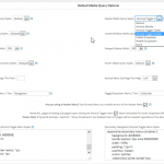
In Dynamik (Dynamik Design > Responsive), you can select various Navbar Media Query Styles, they all work except the two toggle ones... Let me know if you need more information.
Please fill below private detail box with login details of your website and ftp access. thanks
Thanks for the details, I am checking in your website, will feedback if there is any found.
Since it is a live product website, I can not debug it without deactivate plugins and switch themes, could you export your database with mysql tools (PHPmyadmin), and post a downloadable URL for the database dump file in below private detail box, I need to debug it in my localhost, thanks
Thanks for the details, I can download the database dump file, and trying to duplicate same problem in my localhost, will feedback if there is any found.
Thanks for the details, since it is a compatibility problem, it is hard to debug the problem, I just tested it in your website:
hidden link
Both menus work in mobile size window.
using below layout:
hidden link
I suggest you create a empty page template without the menus items in it, manually add the menus into layout as above layout.
That causes other issues re the responsive menu display. I will see if I can work out the conflict or find out any further information that will help trouble shoot and get back to you. Many thanks.
I added this to functions php, which helped a lot. A bit of tidying to correct some CSS... but it may help point someone in the right direction if using Dynamik and Vertical Toggle menus.
//* Reposition the primary navigation menu before header
remove_action( 'genesis_header_right', 'genesis_do_nav' );
add_action( 'genesis_before_header', 'genesis_do_nav', 12 );
//* Reposition the secondary navigation menu before header
remove_action( 'genesis_after_header', 'genesis_do_subnav' );
add_action( 'genesis_before_header', 'genesis_do_subnav', 13 );
//* Reposition the primary mobile nav before header
remove_action( 'genesis_header_right', 'dynamik_mobile_nav_1', 9 );
add_action( 'genesis_before_header', 'dynamik_mobile_nav_1', 10 );
//* Reposition the secondary mobile nav before header
remove_action( 'genesis_after_header', 'dynamik_mobile_nav_2' );
add_action( 'genesis_before_header', 'dynamik_mobile_nav_2', 12 );
PS... also using a Header Menu.

