I have an issue with the mobile responsiveness of the Layouts integration with Avada.
- I am using Layouts with the Avada integration.
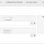
- I try to set up a grid with 2 columns, the main content on the left, and a sidebar on the right.
- I use the Avada sidebar cell
- I also tried it without the sidebar cell, with just a text cell.
How it should work:
For the mobile view, I am expecting the sidebar or right column to be placed below the left column, both displayed full width. Avada without Toolset does it like that.
How it does work now:
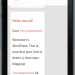
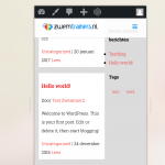
Instead, the main content and sidebar are placed in columns next to each other instead of below, like with the desktop view. So the sidebar is placed in a very narrow column, untill it breaks at content that is too wide to display, then it continues below the main content.
I tried de-activating all non-toolset plugins, but the issue remains.
Dear Jack,
Have you test with the original Avada theme? does the same problem exists when there isn't any other custom CSS codes?
The problem you mentioned above seems like anther thread here:
https://toolset.com/forums/topic/sidebar-not-responsive/
which is a CSS problem, can you provide a live page URL with same problem? I need to check it in my Chrome browser.
Hi,
Yes, it is a standard Avada theme, I checked it with all non-toolset plugins disabled. I rather not publicly list the URL's, also the site is protected with a password at the moment, since it is still being developed.
Please give access to a private reply - I will give you a username and password and the URL's of the pages where this is happening.
Thank you!
I enabled the private detail box, please provide the credentials of your website, thanks
Thanks for the details, the problem is in your theme file:
hidden link
below codes:
.col-sm-8{width:66.66666667%}
You can remove it and test again, I suggest you contact the author of your theme for it
Hi,
The theme is an unmodified standard Avada theme, where only the name of the theme folder has been changed. No changes have been made to any of the Avada theme files - the theme as it is now is 100% out-of-the-box Avada.
Since the themes files are 100% standard, isn't this CSS-rule something that should be handled by the Toolset/Avada integration plugin?
Do you see a way to overrule the CSS of the Avada theme, so it is not needed to modify the files every time an update to Avada is pushed?
Thank you!
PS. Would you please be so kind to remove the theme name from your post, since it discloses personal information? Thank you!
An addition to my previous post:
I tried to test it by removing the css you suggested. However, the problem still occurs when I remove it. I also found out that the width of the column does not matter. For example - making the main content 9 columns and the sidebar 3, or 10 columns and the sidebar 2 also gives the problem.
There are lots of questions in this thread, I am trying to answer them one by one:
Q1) isn't this CSS-rule something that should be handled by the Toolset/Avada integration plugin?
The Toolset/Avada integration plugin can not modify your theme files.
your theme output .col-sm-8 as 66% width when in mobile size, which is not what you expected: full width in mobile size. see the CSS codes:
.col-sm-8{width:66.66666667%}
The CSS rules is defined in your theme file:
hidden link
which is not compatible with Bootstrap, so as I suggest you above, the best way is contact your theme author, if it is a original Avada theme, you can contact the author of Avada theme for it.
Q2) Do you see a way to overrule the CSS of the Avada theme, so it is not needed to modify the files every time an update to Avada is pushed?
Yes, it is possible, for example, you can try this:
Dashboard-> Toolset-> Layouts CSS and JS, in the CSS window, add below codes:
@media (min-width: 750px){
    .col-sm-9 {
    	width: 75%;
    }
}
@media (min-width: 0px) and (max-device-width: 749px){
    .col-sm-9 {
    	width: 100%;
    }
}

@media (min-width: 750px){
    .col-sm-8 {
    	width: 66.66666667%;
    }
}
@media (min-width: 0px) and (max-device-width: 749px){
    .col-sm-8 {
    	width: 100%;
    }
}
It is just an example, you will need to customize it to what you want.
Q3) the problem still occurs when I remove it.
Please clear the cache of your browser and test again.
Hello,
I tried everything you suggested, but nothing seems to happen. Are you sure this isn't a bug in the Layouts/Avada integration plugin? All Avada files are unmodified, as are the Toolset files. I reinstalled the Avada theme to be sure, but it didn't help.
I moved the site to a separate testing server to be able to share URL's quicker. The admin access I provided you earlier works for this server as well.
I have set-up a 2 pages to show the difference. Both pages are the same, the only difference is the way they are rendered, Avada only or Avada with Layouts:
The page is 9 columns on the left and 3 columns on the right. The page with Layouts used the Avada header and footer and the Avada widget/sidebar cell for the sidebar display.
Page Rendered with Avada, without Layouts
hidden link
Same page rendered with Layout for Pages
hidden link
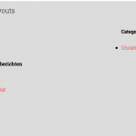
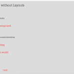
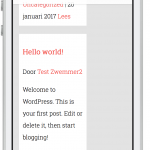
I also added some images to his post to show the differences.
As you can see, the responsiveness for the Layouts page is not right. I tried removing the css code in the Avada theme file, I tried adding the css code you provided and I tried several different settings. Nothing helps, unfortunately.
Besides the responsiveness issue, there are other issues as well, for pages rendered with Layouts. The alignment of the page is different and the styling of the page with Layouts is not following the Avada settings, as you can see in the sidebar - the headers and list items are different.
I did not receive a reply yet, but here is some additional information that might help. I started developing another website with the Avada theme and Toolset. Here I get the exact same problems with the responsiveness of pages with a sidebar generated by Layouts.
You can see that the responsiveness breaks at these pages:
hidden link
hidden link
hidden link
Would it help you if I give you admin access to this test site as well?
Sorry for the delay answer, I am in the holidays, I am checking again in your website, will feedback if there is anything found
I tried below steps in your website:
1) To test and debug in your website, Edit the Layouts "Layout for Blog, Archives and Search Results"
hidden link
Add a widget area cell "Blog Sidebar"
2) Same as I mentioned in above post:
https://toolset.com/forums/topic/toolsetavada-integration-multicolumn-or-sidebar-breaks-responsiveness/#post-483013
Dashboard-> Toolset-> Layouts CSS and JS, in the CSS window, add below codes:
hidden link
@media (min-width: 750px){
    .col-sm-9 {
        width: 75%;
    }
}
@media (min-width: 0px) and (max-device-width: 749px){
    .col-sm-9 {
        width: 100%;
    }
}

@media (min-width: 750px){
    .col-sm-8 {
        width: 66.66666667%;
    }
}
@media (min-width: 0px) and (max-device-width: 749px){
    .col-sm-8 {
        width: 100%;
    }
}
3) Test it in the front-end:
hidden link
What I see is the the sidebar or right column is placed below the left column, see screenshot avada.JPG
Can you confirm it?
Hello,
Thank you for your efforts.
I tried several devices and multiple browsers (Safari, Chrome, Firefox) and always emptied the cache) and i can not confirm it is working correctly now. I also tried some webbased simulators, and in these simulators it is not working as well:
hidden link
hidden link
I attached some screenshots.
I also noticed that all of the links in the left column stop working (they are not clickable anymore) as soon as the responsiveness problem occurs.
I tested it in my Chrome browser:
hidden link
it works fine in the Device Mode of chrome browser, then I tested with my android device, now I can see the problem you mentioned above,
since you are using 25 plugins and a custom avada child theme, I need these:
1) we need to know if there is other compatibility problem in your website, I need your permission to deactivate other plugins and switch theme. you will need to backup your website first
2) if it is a bug, I need to duplicate same problem, please follow our document to provide a copy of your website:
https://toolset.com/faq/provide-supporters-copy-site/
