I have installed Toolset Company reference site.
E.g. hidden link
I tried design to replace the site logo and banner but it does not works very well.
For instance, if I resize the browser width, the site logo will change its position thus block some of the banner details. In addition, if I preview in tablet/mobile device, the mobile nav menu will also block the important details in my banner.
As the logo, banner and menu will resize accordingly and the expected output may differ.
Please advise is there any banner design guideline that I can follow for using this Company reference site theme Or can I have 2 images for desktop and mobile theme?
Thanks.
I see the issue with the Mobile Menu, but I am not sure to understand the issue with Banner/Logo.
Can you send me a few steps or ScreenShots to see this?
About the menu, we chose the overflow for different styling reasons, and usually you will use the menu to make a choice, click on it, and then the menu closes again, so no need to see content while the menu is open.
Either way, even pushed, the content would not be visible on a small screen size as it would probably get pushed below the fold line of a mobile.
I would not suggest change this in your case neither, but if you want you can use.
You could change the styles and make it not positioned absolute (.navbar-collapse)
But this would need some work since if not positioned absolute it also will not be full width.
And it will look "squeezed" if it's not full width.
I strongly suggest to use the case as provided, as this is built for full usability in mind.
Thanks for the reply.
I have provided a few screenshots from Firefox to illustrate further.
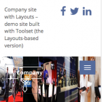
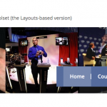
original_desktop.png - The original theme banner to simulate Desktop view
original_mobile.png - The original theme banner (browser resized) to simulate Mobile view
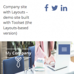
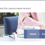
sample_desktop.png - Sample banner to simulate Desktop view
sample_mobile.png - Sample banner (browser resized) to simulate Mobile view
Both original theme and sample banner (from google image search @ hidden link) are using the same image dimension i.e. 1,414px × 247px.
As see from the screenshots, if we use the sample banner and resize it to mobile view, the image will looks weird in the shrinking size. Additionally, the mobile nav menu will also hide the important details (faces).
In addition, the "My Company" logo in the sample_desktop appear in the "first column" of the picture in desktop view. However, in the mobile view, it covers two columns instead.
Therefore, for this theme, I need some help and suggestion to resolve the problem. E.g. on banner design guidelines or edit the theme CSS/HTML?
Thanks.
This is how this Theme is designed.
It can be adapted in a Child Theme. Those Starter Themes are intended to either build on it or see how it's done and then adapt a own theme.
The menu could be moved to another location by moving the Menu Cell in the Respective Layout, or by applying other CSS rules on mobile Screens, with the @media query:
hidden link
The Banner is resizing as well this way on the original Theme.
On the original it's using different minimal height and minimal width (100%) as well as custom margins.
Your issue is very specific to a specific goal you want to achieve on one site.
This requires specific CSS and HTML adaption.
We don't have any document on specific CSS, but we instruct how you can style the Themes and site:
https://toolset.com/documentation/user-guides/toolset-starter-theme/
https://toolset.com/documentation/user-guides/using-html-css-style-layout-cells/
https://toolset.com/documentation/user-guides/image-box-cell/
https://toolset.com/documentation/user-guides/rich-content-cell-text-images-html/
I can not assist Custom CSS or HTML as this is a required knowledge when using Toolset, but I can, if you have a working site with login details, offer some examples and external DOC's to learn how to do this.
Thank you
Thanks for your help. Have managed to shift the logo and menu by following hidden link approach.
Will take a look at media queries next.


