Skip Navigation

[Resolved] Display CRED checkboxes in columns based on screen size

This thread is resolved. Here is a description of the problem and solution.

Problem: I would like to arrange my CRED form checkboxes into multiple columns. I would like the number of columns to be dynamic based on the screen size, using media queries.

Solution:
There is not a way to apply different CSS classes to each checkbox, or to wrap some checkboxes in container elements. Instead, you can use CSS columns and media queries:

.wpt-form-set-checkboxes.wpt-form-set-checkboxes-wpcf-sport {
    columns: 2;
}
 
@media screen and (min-width: 960px) {
       .wpt-form-set-checkboxes.wpt-form-set-checkboxes-wpcf-sport {
         columns: 4;   
      }
}
 
.wpt-form-set-checkboxes.wpt-form-set-checkboxes-wpcf-sport li {
    display:block;
}    

Relevant Documentation: https://www.w3schools.com/css/css3_multiple_columns.asp
https://developer.mozilla.org/en-US/docs/Web/CSS/Media_Queries/Using_media_queries

This support ticket is created 6 years, 12 months ago. There's a good chance that you are reading advice that it now obsolete.

This is the technical support forum for Toolset - a suite of plugins for developing WordPress sites without writing PHP.

Everyone can read this forum, but only Toolset clients can post in it. Toolset support works 6 days per week, 19 hours per day.

Sun Mon Tue Wed Thu Fri Sat
8:00 – 12:00 8:00 – 12:00 8:00 – 12:00 8:00 – 12:00 8:00 – 12:00 - -
13:00 – 17:00 13:00 – 17:00 13:00 – 17:00 13:00 – 17:00 13:00 – 17:00 - -

Supporter timezone: America/New_York (GMT-04:00)

This topic contains 4 replies, has 2 voices.

Last updated by Jeffrey 6 years, 11 months ago.

Assisted by: Christian Cox.

Author
Posts
#595561

I am trying to style a selectboxes of a cred form,

1st, I change the items to horizontal, add

display : inline-block

2nd, I feel the select boxes too messy, then I try to divide into 4 columns. so I did add either these code

columns: 4; or columns count: 4;

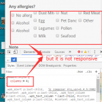
everything is working well, except no responsive. I also tried to add code(just in memory) @media mix 768, using to set the columns changing to 2 or 1 when visitor use tablet or mobile devices. but it doesn't work. still no responsive
I know the best way is add a class like col-sm-3 to each items. but I don't know where I can do that? and if it is not possible, how to rewrite the css? if it is very difficult, I give up 🙂

Best regards!

#595726

Hi, unfortunately there is not a way to add CSS classes arbitrarily to each checkbox option in a CRED field. The only way I know how to do that would be to use JavaScript, like jQuery, to manipulate the DOM and add classes to each list item. If you have this CRED form available online, I can take a look and see if I can recommend another approach using only CSS. Let me know where to find the form.

#595747
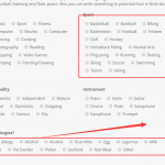
QQ图片20171204135609.png
QQ图片20171204135303.png
QQ图片20171204135213.png

Thank you Christian, that is a user form, so you have to log into an user account. I have register an account, you can log into the account and see the page hidden link through username toolset02, password 1324 .

#595925

I think the inline element style you applied in the inspector was overriding the media query style. I'm not exactly sure what you're trying to accomplish, but it's definitely possible to specify different column counts for different screen dimensions. For example, add something like this in your CSS:

.wpt-form-set-checkboxes.wpt-form-set-checkboxes-wpcf-sport {
    columns: 2;
}

@media screen and (min-width: 960px) {
       .wpt-form-set-checkboxes.wpt-form-set-checkboxes-wpcf-sport {
         columns: 4;   
      }
}

.wpt-form-set-checkboxes.wpt-form-set-checkboxes-wpcf-sport li {
    display:block;
}    

You will see the sport checkboxes appear in 4 columns at 960px+ and 2 columns below 960px.

#597490

Done! Thank you so much for the help Christian! 🙂