Skip Navigation

[Resolved] CSS not working on template

This thread is resolved. Here is a description of the problem and solution.

Problem: The bottom margins I have applied to the "row" CSS class do not appear to effect all the items in mobile. It only shows a margin on some items.

Solution: Apply the bottom margin to the individual items rather than the row, since the columns in a row are broken into separate rows on mobile.

This support ticket is created 7 years, 2 months ago. There's a good chance that you are reading advice that it now obsolete.

This is the technical support forum for Toolset - a suite of plugins for developing WordPress sites without writing PHP.

Everyone can read this forum, but only Toolset clients can post in it. Toolset support works 6 days per week, 19 hours per day.

Sun Mon Tue Wed Thu Fri Sat
8:00 – 12:00 8:00 – 12:00 8:00 – 12:00 8:00 – 12:00 8:00 – 12:00 - -
13:00 – 17:00 13:00 – 17:00 13:00 – 17:00 13:00 – 17:00 13:00 – 17:00 - -

Supporter timezone: America/New_York (GMT-04:00)

This topic contains 2 replies, has 2 voices.

Last updated by JorgeE7101 7 years, 2 months ago.

Assisted by: Christian Cox.
Author
Posts
#575338
Screen Shot 2017-10-02 at 12.21.54.png
Screen Shot 2017-10-02 at 12.21.09.png

Hello. I'm using a template for one of my wordpress archives and the CSS doesn't appear to be working completely in the loop.

I've got this code in the loop output editor:


<!-- wpv-loop-start -->
	<wpv-loop wrap="3" pad="true">
		[wpv-item index=1]
		<div class="row">
			<div class="col-sm-4">[wpv-post-body view_template="Loop item in Paises archive landing page"]</div>
		[wpv-item index=other]
			<div class="col-sm-4">[wpv-post-body view_template="Loop item in Paises archive landing page"]</div>
		[wpv-item index=3]
			<div class="col-sm-4">[wpv-post-body view_template="Loop item in Paises archive landing page"]</div>
		</div>
		[wpv-item index=pad]
			<div class="col-sm-4"></div>
		[wpv-item index=pad-last]
			<div class="col-sm-4"></div>
	</wpv-loop>
	<!-- wpv-loop-end -->

And using CSS I'm able to add some pace between the share div and the next thumbnail.

 
.row {
  margin-bottom: 50px;
  clear: both;
}

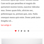
However, on mobile it adds the space on some posts rows, but not on others. Please view attached screenshots.

Would you be able to help me understand why is doing this?

Thanks.

#575419

I believe it's because a div.row surrounds 3 items at a time, not each item. When you view the site at mobile sizes, each item is not a separate row - it's a column. So the margin you apply to the bottom of a row only affects the last item in each group of 3. You should instead apply your bottom margin to each item instead of each row. Or, if you want to target each item on mobile sizes, you'll need to use a media query that targets the smaller screen sizes and column classes, and apply your margins there. You may also need to remove the margin from the row in this case.

#575456

Thanks Christian, that was it! 🙂