Skip Navigation

[Gelöst] Equal Heights For Each Row In Bootstrap Grid

Dieser Thread wurde gelöst. Hier ist eine Beschreibung des Problems und der Lösung.

Problem:
How to make each row equal height, and match the height of the tallest grid item within each row? I'd prefer the grid to automatically adapted to the height of the tallest item in each row.

Solution:
Here is basic HTML structure for creating Equal heights for each column in a row:
https://toolset.com/forums/topic/equal-heights-for-each-row-in-bootstrap-grid/#post-589049

This support ticket is created vor 6 Jahre, 5 Monate. There's a good chance that you are reading advice that it now obsolete.

This is the technical support forum for Toolset - a suite of plugins for developing WordPress sites without writing PHP.

Everyone can read this forum, but only Toolset clients can post in it. Toolset support works 6 days per week, 19 hours per day.

No supporters are available to work today on Toolset forum. Feel free to create tickets and we will handle it as soon as we are online. Thank you for your understanding.

Sun Mon Tue Wed Thu Fri Sat
- 12:00 – 17:00 12:00 – 17:00 12:00 – 17:00 12:00 – 17:00 12:00 – 17:00 -
- 18:00 – 21:00 18:00 – 21:00 18:00 – 21:00 18:00 – 21:00 18:00 – 21:00 -

Supporter timezone: Asia/Karachi (GMT+05:00)

This topic contains 2 Antworten, has 2 Stimmen.

Last updated by Brent Urbanski vor 6 Jahre, 5 Monate.

Assisted by: Noman.
Author
Artikel
#588685
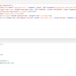
Screen Shot 2017-11-10 at 9.37.45 AM.png
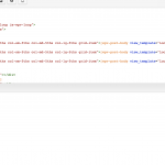
Screen Shot 2017-11-10 at 9.37.23 AM.png

Would you happen to know how to make each row equal height, and match the heigh of the tallest grid item within each row?

I can set a specific height value with css for the grid item, but I'd prefer the grid to automatically adapted to the height of the tallest item in each row.

I'm working locally, so I cannot share a web page. I've uploaded some images of my View, but not sure if this helps.

#589049

Noman
Supporter

Languages: Englisch (English )

Timezone: Asia/Karachi (GMT+05:00)

Hi Brent,

Thank you for contacting Toolset support. Here is basic HTML structure for creating Equal heights for each column in a row:

<!DOCTYPE html>
<html lang="en">
<head>
<title>Equal height rows</title>
<meta charset="utf-8">
<meta name="viewport" content="width=device-width, initial-scale=1">
<link rel="stylesheet" href="css/bootstrap.min.css">
<script src="js/jquery.min.js"></script>
<script src="js/bootstrap.min.js"></script>
<style type="text/css">
.list {
	display: flex;
	flex-wrap: wrap;
}
.list-item {
	display: flex;
	margin-bottom: 20px;
}
.list-content {
	width: 100%;
	background-color: #ccc;
	padding: 10px;
}
</style>
</head>
<body>
<div class="container">
<div class="row list">
  <div class="col-sm-3 list-item">
    <div class="list-content">
      <h2>box 1</h2>
      <p>Lorem ipsum dolor sit amet, consectetur adipisicing elit.</p>
	  <p>Lorem ipsum dolor sit amet, consectetur adipisicing elit.</p>
    </div>
  </div>
  <div class="col-sm-3 list-item">
    <div class="list-content">
      <h3>box 2</h3>
      <p>Lorem ipsum dolor sit amet, consectetur adipisicing elit.</p>
    </div>
  </div>
  <div class="col-sm-3 list-item">
    <div class="list-content">
      <h3>box 3</h3>
      <p>Lorem ipsum dolor</p>
    </div>
  </div>
  <div class="col-sm-3 list-item">
    <div class="list-content">
      <h3>box 4</h3>
      <p>Lorem ipsum dolor</p>
    </div>
  </div>
  <div class="col-sm-3 list-item">
    <div class="list-content">
      <h1>box 5</h1>
    </div>
  </div>
  <div class="col-sm-3 list-item">
    <div class="list-content">
      <h1>box 6</h1>
    </div>
  </div>
  </ul>
</div>
</body>
</html>

For more info:
hidden link

Thank you

#589340

Works perfectly, Norman.

Thanks for your help.

This ticket is now closed. If you're a WPML client and need related help, please open a new support ticket.